Recruitment analytics dashboard
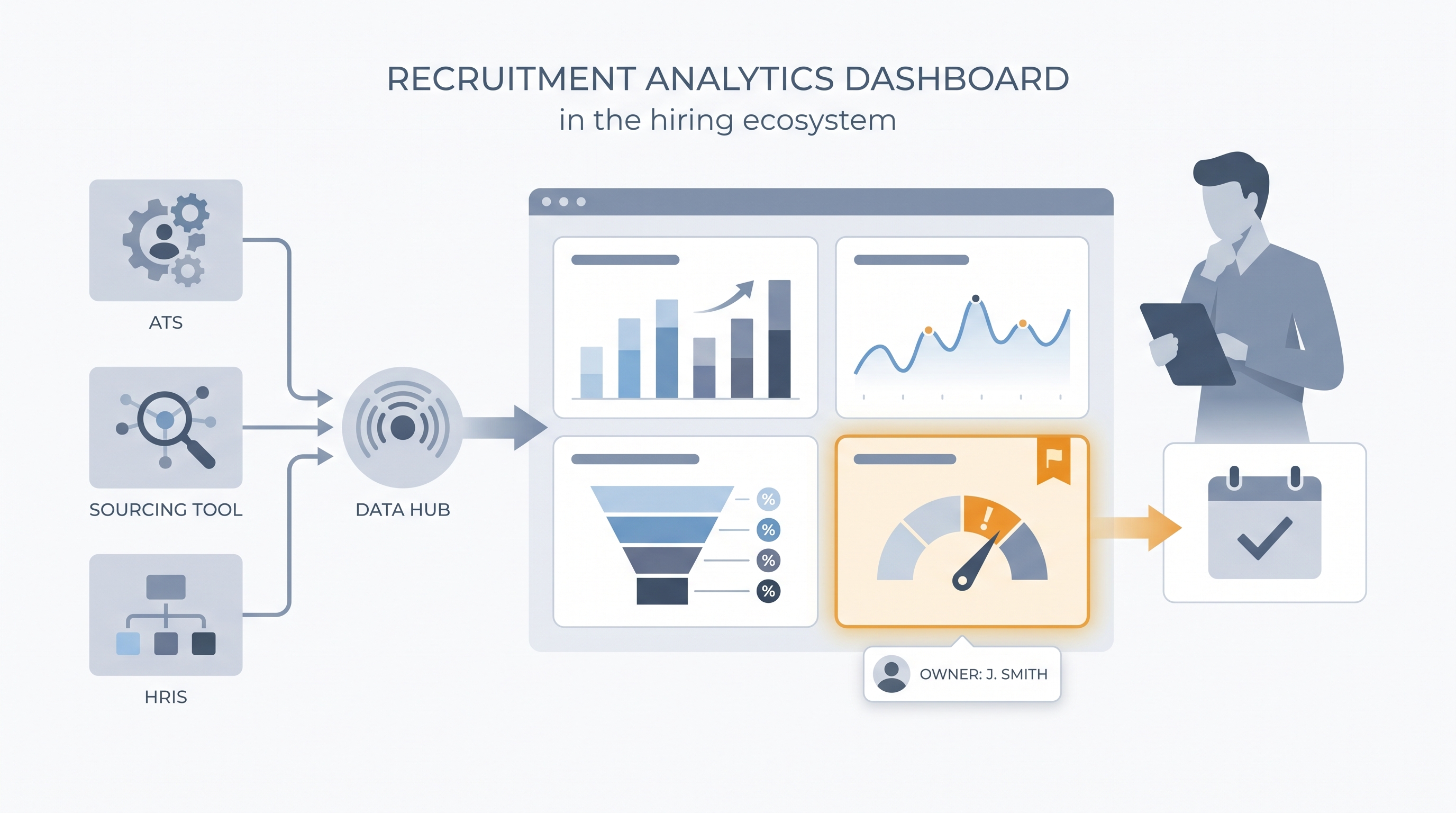
A live view that pulls hiring data from your ATS, sourcing tools, and HRIS into panels showing pipeline health, stage conversion, and source effectiveness so TA teams can act on patterns rather than dig through raw exports.
Michal Juhas · Last reviewed May 15, 2026
What is a recruitment analytics dashboard?
A recruitment analytics dashboard is a live view of hiring performance: how long roles are taking, where candidates are dropping out, which sourcing channels produce interviews versus just applications, and whether the current pipeline can cover open reqs on schedule. It pulls from your ATS, sourcing tools, and sometimes your HRIS, so the numbers update without a manual export.
The difference between a useful dashboard and a decorative one is whether someone acts on it. A screen full of charts that nobody reviews weekly is just a polished way to avoid knowing what is happening in the pipeline.
In practice
- A TA manager at a 600-person logistics company sets up four panels in their ATS analytics view: time-to-fill by business unit, stage conversion per step, source of hire by interview rate (not application count), and offer acceptance rate. Every Monday stand-up opens with those four numbers and nothing else.
- A recruiter notices one hiring manager's reqs show offer acceptance 15 points below the company average. The dashboard surfaces it as an amber flag. A conversation reveals that the final-round wait time has stretched to ten days. No AI flagged it; the dashboard did.
- "Source of hire" appears on almost every dashboard but is rarely trusted. One TA team exports their ATS data and finds 40 percent of source fields are blank or labeled "other." They stop debugging the dashboard and start auditing how recruiters log candidate origins.
Quick read, then how hiring teams use it
This is for recruiters, sourcers, TA, and HR partners who need the same vocabulary in debriefs, vendor calls, and budget reviews. Skim the first section when you need a fast shared picture. Use the second when you are deciding how metrics show up in ATS configuration, reporting tools, or executive dashboards.
Plain-language summary
- What it means for you: A recruitment analytics dashboard is one screen that shows how hiring is going, how fast, from where, and where it is slowing down, so you do not need to pull a CSV every Monday to answer a leadership question.
- How you would use it: Choose four or five metrics your team agrees on, configure the ATS to populate those fields consistently, then open the dashboard once a week and look for the one amber indicator that needs action.
- How to get started: Pull time-to-fill and offer acceptance rate from your ATS for the last six months, broken down by department. The outlier department is where your first conversation should go.
- When it is a good time: Before any budget or headcount review, and immediately after a spike in offer declines or longer-than-usual fill times signals something has shifted in the market.
When you are running live reqs and tools
- What it means for you: A dashboard is only as reliable as your ATS stage definitions. If recruiters use "offer extended" and "offer pending" interchangeably, the average time-to-hire will be wrong and no dashboard layer will fix that upstream data problem.
- When it is a good time: When TA is asked to defend headcount spend, justify tool costs, or connect recruiting output to business outcomes in a quarterly review.
- How to use it: Configure one named owner per key metric, set thresholds that trigger a conversation rather than just turning a number red, and run the dashboard review on a fixed weekly cadence with the same people every time.
- How to get started: Audit how your team currently defines three key stages in the ATS. If the definitions differ across recruiters, reconcile those first. Then configure the dashboard to read from the agreed stage names before you call it live.
- What to watch for: Vanity metrics such as total applications received crowding out outcome metrics. High application volume with a low interview rate is a sourcing quality problem, not a success signal. Watch also for funnel drop-off analysis that stops at stage counts without tracing root cause.
Where we talk about this
AI with Michal Sourcing Lab covers recruitment analytics in the context of AI-assisted recruiting: which numbers to surface in model prompts, how to structure ATS exports for analysis, and when AI-generated insights about pipeline health are trustworthy versus when they are working from dirty input data. Come with your real ATS export, a metric your leadership does not agree on, and a data quality question you have not been able to answer from standard reporting.
Around the web (opinions and rabbit holes)
Third-party creators move fast. Treat these as starting points, not endorsements, and double-check anything before you wire candidate data.
YouTube
- Recruiting Metrics Dashboard (YouTube search) surfaces practitioner walkthroughs from AIHR and Recruiting Daily on ATS analytics views, panel configurations, and weekly review formats.
- HR Analytics: Talent Acquisition Metrics (AIHR and peers) covers core KPIs and how to connect pipeline data to a visual dashboard TA leaders can act on each week.
- How to Present Hiring Data to Leadership (various) walks through how to frame stage conversion and cost-per-hire in language the executive team can use in headcount decisions.
- How do you structure your recruiting analytics? in r/recruiting has candid threads about which metrics TA leaders actually put in front of leadership and which stay internal.
- Source of hire is always wrong in r/recruiting is a frank conversation about ATS data quality problems that break source attribution before a dashboard can help.
- What HR metrics do you report weekly? in r/humanresources covers the cadence and format questions teams wrestle with before reporting becomes routine.
Quora
- What should a recruitment analytics dashboard include? collects practitioner answers on which panels are most useful across different team sizes and business contexts (read critically for definition consistency).
Dashboard panel quick reference
| Panel | What it answers | Data trap |
|---|---|---|
| Stage conversion rates | Where are candidates dropping out? | Mixed stage definitions across recruiters |
| Source of hire by interview rate | Which channel sends quality candidates? | Blank source fields from manual ATS entry |
| Time-to-fill by department | How fast are roles closing per team? | No agreed definition of when a req is open |
| Offer acceptance rate | Are we losing candidates at close? | Not segmenting by role level or function |
| Pipeline coverage | Do we have enough active candidates? | Counting stale candidates as active |
Related on this site
- Glossary: Talent acquisition metrics, Recruitment analytics software, Hiring funnel conversion rates, Funnel drop-off analysis, Pipeline coverage reporting
- Blog: How to use AI in recruiting
- Guides: Sourcers, Hiring managers
- Course: Starting with AI: the foundations in recruiting
- Live cohort: Sourcing Lab
- Membership: Become a member