Recruitment metrics dashboard
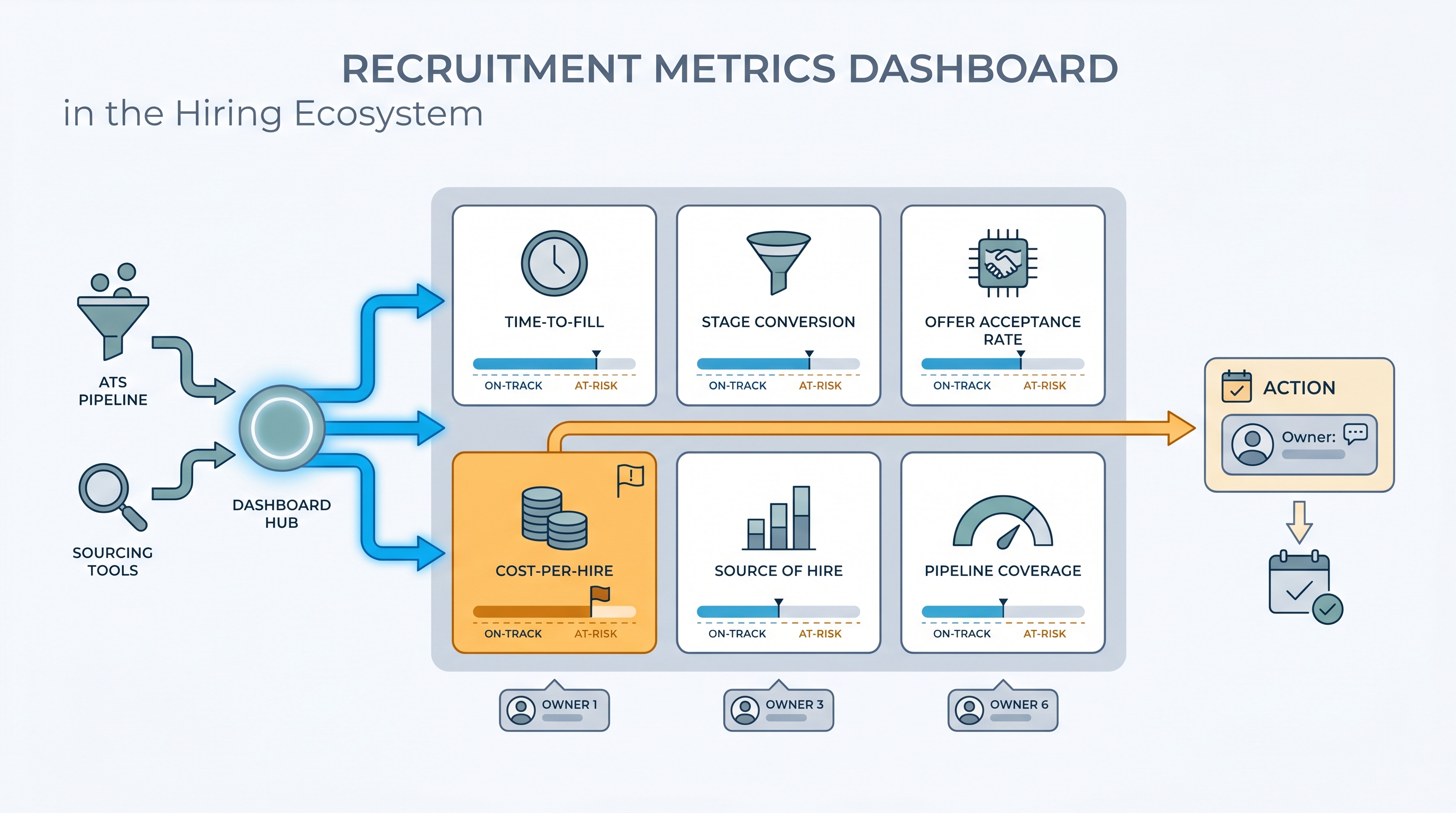
A centralized view of the KPIs that define how a hiring team is performing: time-to-fill, offer acceptance rate, stage conversion, cost-per-hire, and source quality. It turns ATS stage data into shared numbers TA, HR, and leadership can discuss without pulling a spreadsheet.
Michal Juhas · Last reviewed May 15, 2026
What is a recruitment metrics dashboard?
A recruitment metrics dashboard is a shared scorecard for your hiring function: the five or six numbers that define whether the team is performing and whether open reqs are on a path to close on schedule. Time-to-fill, offer acceptance rate, stage conversion at each funnel step, source of hire by interview rate, and cost-per-hire are the core set most teams settle on after their first quarter using one consistently.
The difference between a useful dashboard and a decorative one is metric ownership. If a number turns amber on Tuesday morning, someone specific has a conversation with the relevant hiring manager by Thursday. If no such person exists for a given panel, that panel is decoration.
In practice
- A TA lead at a fast-growing SaaS company runs a weekly Monday review with five panels: time-to-fill by role family, stage conversion per funnel step, offer acceptance rate, source of hire by interview rate, and pipeline coverage. The review lasts 20 minutes and ends with at most two named actions.
- A recruiter notices one business unit has a time-to-fill of 62 days against a 45-day target. The dashboard surfaces it as a red flag. A quick look at stage conversion shows candidates sitting in the hiring manager review stage for 14 days. No AI flagged it. The metric did.
- "Cost-per-hire" appears on almost every dashboard template but is rarely consistent across teams. One TA team realizes they have been including agency fees in some reqs and not others. They pause the metric, agree on a definition, and relaunch it three weeks later.
Quick read, then how hiring teams use it
This is for recruiters, sourcers, TA, and HR partners who need the same vocabulary in stand-ups, budget reviews, and vendor negotiations. Skim the first section when you need a fast shared picture. Use the second when you are deciding how to configure your ATS, set up a BI connector, or defend a metric to leadership.
Plain-language summary
- What it means for you: A recruitment metrics dashboard is one screen with the five or six numbers that define whether your hiring is working: how fast, how costly, where candidates fall out, and which channels produce quality interviews versus just volume.
- How you would use it: Agree on definitions with your team before touching any tool, then configure four or five fields consistently in the ATS so the numbers populate automatically each week.
- How to get started: Pull time-to-fill and offer acceptance rate for the last 90 days from your ATS, broken by department. The outlier department is the right first conversation to have before you build anything more complex.
- When it is a good time: Before any budget or headcount review, and right after a spike in declines or stalled fills signals something has shifted in the market or in process.
When you are running live reqs and tools
- What it means for you: Metrics are only as reliable as your stage definitions. If recruiters use "offer extended" and "offer pending" interchangeably, time-to-hire is wrong by construction and no dashboard layer will fix that upstream data problem.
- When it is a good time: When TA is asked to connect recruiting output to business impact, justify a tool investment, or explain why a class of reqs consistently misses target fill time.
- How to use it: Name an owner per metric, set an amber threshold that triggers a conversation not just a color change, and lock in a weekly review cadence with the same people every time. Cross-link your dashboard to pipeline coverage reporting so low-coverage flags surface before a req goes critical.
- How to get started: Audit how your team defines three core stages in the ATS. If definitions differ across recruiters, reconcile those first. Then configure the dashboard to read from the agreed stage names before you call it live.
- What to watch for: Vanity metrics crowding out outcome metrics. High application volume with a low interview rate is a sourcing quality problem, not a success signal. Watch also for stage conversion data that shows absolute candidate counts without percentages, which makes bottlenecks invisible at scale.
Where we talk about this
AI with Michal Sourcing Lab covers recruitment metrics in the context of AI-assisted hiring: which numbers belong in a model prompt when asking for pipeline analysis, how to structure ATS exports so AI summaries read clean data, and when metric-driven insights are trustworthy versus when they are working from gaps in the source data. Come with your ATS name, the question your head of People asked last quarter that nobody could answer, and a metric definition your team currently disagrees on.
Around the web (opinions and rabbit holes)
Third-party creators move fast. Treat these as starting points, not endorsements, and double-check anything before you wire candidate data.
YouTube
- Recruiting Metrics Every TA Team Should Track (YouTube search) surfaces AIHR and Recruiting Daily walkthroughs on KPI selection, ATS configuration, and how to present pipeline health to leadership.
- HR Analytics: Key Talent Acquisition Metrics Explained (YouTube search) covers the definitions behind time-to-fill, offer acceptance rate, and cost-per-hire in language you can bring to a cross-functional review.
- How to Set Up a Recruiting Dashboard in Your ATS (YouTube search) shows practical configuration steps across common ATS platforms with real data hygiene advice from practitioners.
- What recruiting metrics do you actually report? in r/recruiting has candid threads about which numbers TA leaders put in front of leadership and which stay internal because the definitions are still contested.
- Cost per hire: how do you calculate it? in r/recruiting covers the definitional disagreements that make this metric inconsistent across companies and the shortcuts teams use to make it comparable.
- ATS reporting vs. external BI dashboards in r/humanresources explores when built-in ATS analytics are enough and when teams connect to external BI tools for better trend analysis.
Quora
- What KPIs should a recruitment dashboard show? collects practitioner answers on metric selection across different team sizes and industries (read critically for context-specific differences in how companies define each number).
Core KPI reference
| Metric | What it measures | Common data trap |
|---|---|---|
| Time-to-fill | Days from req approved to offer accepted | No agreed definition of req open date |
| Stage conversion rate | Percentage advancing per funnel step | Mixed stage names across recruiters |
| Offer acceptance rate | Accepted offers as a share of offers extended | Verbally accepted versus signed offer conflated |
| Source of hire by interview rate | Channel quality, not just volume | Blank source fields in 30 to 40 percent of records |
| Cost-per-hire | Total spend divided by hires in a period | Agency fees inconsistently included or excluded |
| Pipeline coverage | Active candidates per open req | Stale candidates counted as active |
Related on this site
- Glossary: Talent acquisition metrics, Recruitment analytics dashboard, Hiring funnel conversion rates, Pipeline coverage reporting, Stage conversion hiring funnel
- Blog: How to use AI in recruiting
- Guides: Sourcers, Hiring managers
- Course: Starting with AI: the foundations in recruiting
- Live cohort: Sourcing Lab
- Membership: Become a member